01 — OVERVIEW
A simple running shoe tracking experience has been designed for both mobile and web, with light and dark modes. Every interaction is kept manual, clear, and focused, with unnecessary or unrelated features intentionally excluded.
2 — PROBLEM & GOAL
Running shoe wear is often overlooked, making it difficult to know when a pair has reached the end of its useful life. A simple way to track shoe usage and receive timely replacement reminders is needed.
“A simple platform to track your running shoes’ health.”
Four key roles brought the founding vision from concept to completion.
01
Add a shoe in seconds:
Brand, model, nickname, done.
02
Track every run manually:
Log distance and activity type with a few simple taps.
03
Get timely replacement alerts:
Be notified before worn-out shoes become a concern.
04
Feel guided, not overwhelmed:
A low friction experience with a touch of warmth.
03 — RESEARCH & COMPETITOR ANALYSIS
The research compared general running trackers, multi-sport gear logs, and dedicated shoe-tracking apps, mapping their features against Bodo Bodo’s planned feature set.

4 — KEY INSIGHTS
01
Manual tracking keeps the experience simple and focused.
Distance, activity type, and shoe usage are logged manually, keeping the experience simple and giving users full control over their tracking.
02
Simplicity Over Unnecessary Complexity
Garmin Connect offers extensive tracking with multiple metrics, notes, photos, and usage thresholds, but the experience is highly data-driven and lacks a personal, approachable feel. This helped define Bodo Bodo’s direction toward a simpler and more engaging experience.
03
Focused experiences succeed through clarity, not feature overload.
ShoeTrack, Shooz, and Stride Track prioritise a simple habit loop, quick logging, replacement reminders, and at a glance tracking, rather than complex configuration.
04
A simple setup creates a stronger first impression.
Simple brand and model selection reduces setup friction, while multi-field configuration can make the process feel unnecessarily complex.
05 — LIBRARY SELECTION
The Product Owner requested the use of existing, ready-to-use libraries instead of building components from scratch. Four candidates were evaluated based on flexibility, available UX patterns, and suitability for the product.
The fit was evaluated against specific needs: visual storytelling for shoe wear, clear dashboards, insight cards, low-friction interactions, and a warm, approachab


Although shadcn/ui scored higher for web-only visual quality, the product was designed for both iOS and desktop from the start. Using a web-only library would have required maintaining separate component systems. Tamagui offered cross-platform support from a single codebase, making it the more practical choice for the overall product.


6 — VISUAL DESIGN & DESIGN SYSTEM
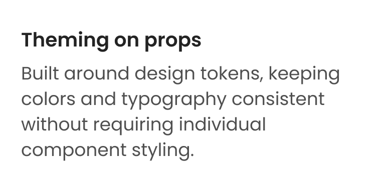
Tamagui provided the foundation; a token based type scale and theme able components. The brand layer added the visual identity through Poppins, a coral color palette, and soft semi-rounded corners inspired by the mascot’s shoelace loops.
Typography
Body and UI text run in Poppins, set on the same step scale Tamagui’s type tokens provide ; the sizing system was kept, the typeface was replaced.

Colour
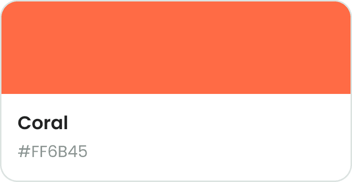
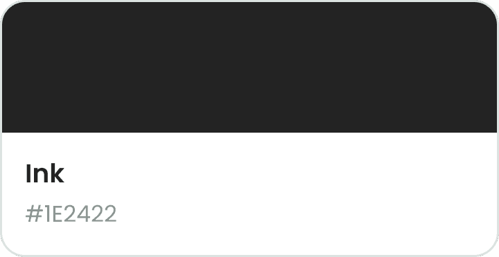
One coral runs through every primary action and progress state, complemented by a teal accent color for secondary emphasis and visual balance.


Spacing & corner radius
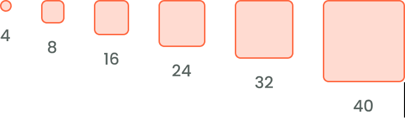
A 4pt spacing scale with a rounded radius system, from subtle corners to fully rounded buttons and pills.