Our Team
3 UX/UI designers
My role
User researcher, Visual designer
Duration
April 2026-May 2026
AI Memory & Context
Helps the AI remember important business goals, metrics, and preferences.
Side Panel Redesign
Makes navigation clearer by replacing technical labels with simple language.
Onboarding Popup
Helps users understand the two product options and choose the right one.

❌ The main problem
The platform used technical language that described how the system worked, not what users could achieve. This made the product harder for non-technical users to understand.
✅ The design approach
I simplified the language across the product. The AI remembers important context, the navigation explains what each action does, and the onboarding helps users choose the right path.
Understanding the product
DataCalculus helps business users analyse their own data without needing technical skills.
Before designing the solution, I first mapped the three main parts of the product.
Data Scientist AI
Users upload data, ask questions, and receive insights in plain language.
🎯 Primary scope
Admin Tools
Used to manage teams, accounts, and shared organisation settings.
🔧 Supporting scope
Visualise
A separate product that turns text, reports, and ideas into visual content. No data upload is needed.
🚪 Popup scope
What I noticed
The Data Scientist AI and Visualise serve very different needs, but both start from the same entry point.
A business user may want to analyse sales data, while a marketer may want to turn a report into an infographic. The original screen did not clearly explain which option was right for each user.
This became the third design area.
What I found by using the product
📋 The original brief focused on session continuity. Users were active in their first AI session, but when they returned, they had to explain the same business context again.
Using the product helped me understand the problem more clearly:
Without memory
Explain goals
Start analysis
Return later
Explain everything again
With memory
Explain goals
Start analysis
Return later
Context is recalled
Continue analysis
Three users, one repeated problem
These representative user types show how missing context affects different ways of using the product.


The first idea didn’t work
My first idea was a Business Profile form where users entered their goals, KPIs, and preferences before using the AI. It solved the memory problem, but added too much setup before users received any value.


Three solutions, one simple approach
Across all three areas, I replaced technical language with clearer, user-friendly language. I also used icons to help users scan actions more quickly.


First session, capturing context without setup
Instead of adding a separate setup flow, the AI asks one optional business question inside the chat. Example cards show what it can remember, such as goals, constraints, and terminology, so users understand the feature before saving anything.

Context saved, analysis starts immediately
After the user shares a goal, the AI confirms it has been saved and continues directly into the analysis. This keeps the flow smooth and makes the response more relevant.

Memory used inside the answer
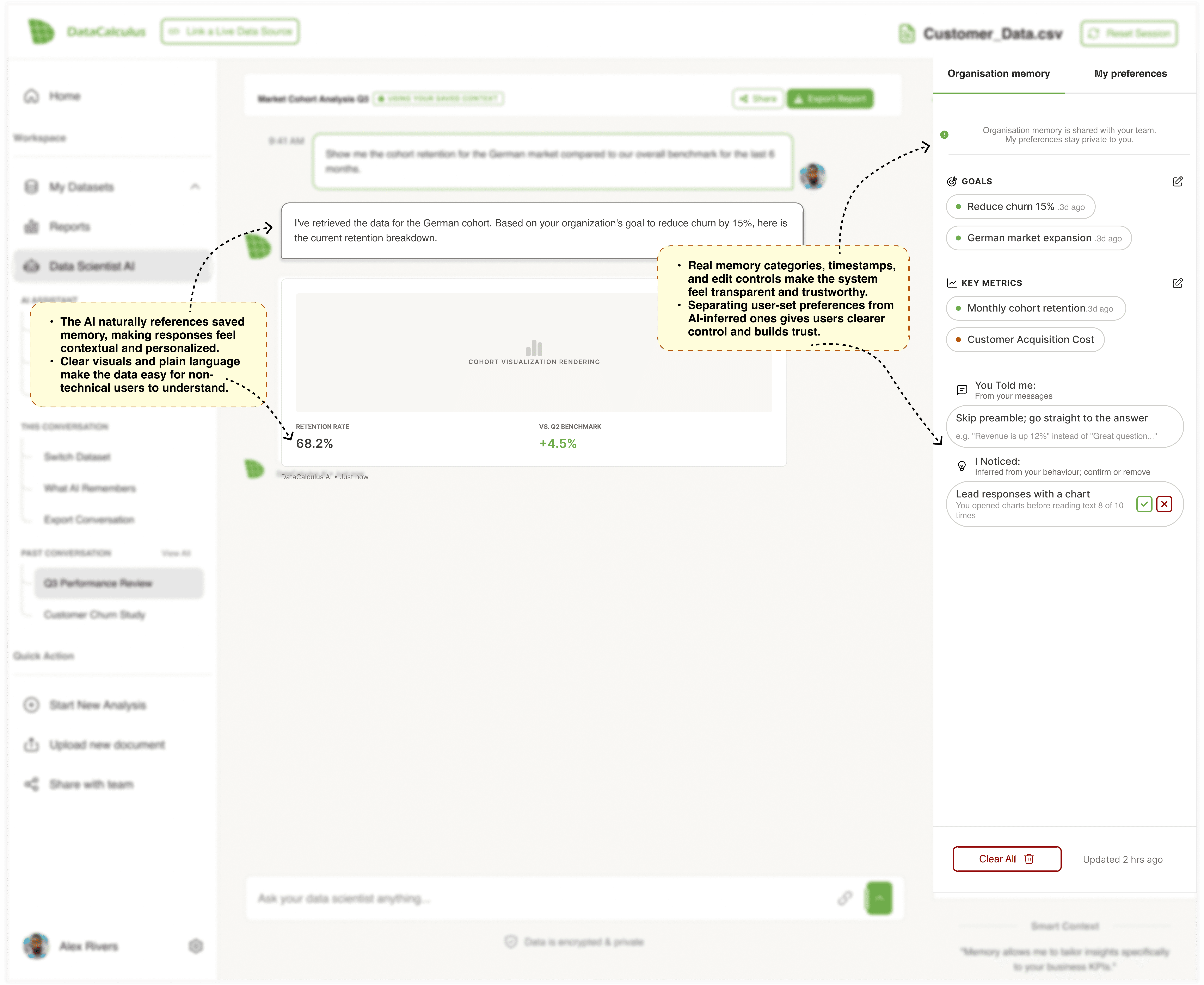
The AI uses saved context directly in the response, so users can see why the analysis focuses on churn reduction and the German cohort. A small label shows that memory was used without interrupting the answer.

Return session with Memory Panel
In a return session, the AI applies saved context automatically. The Memory Panel shows which goals, metrics, and preferences are being used, and lets users edit or remove them.
Empty memory state
When nothing has been saved yet, the panel explains how memory works and invites users to add goals or preferences. The setup stays optional, so users can continue without completing it.

Conflicting team goals
When team goals conflict, the AI shows the issue instead of choosing silently. Users can select one goal, use both, or decide later.

Low-confidence analysis
When the data is not strong enough, the AI explains why and suggests clear next steps, such as checking the sample size or expanding the time range.

Session-only context
Some context is only needed for the current session. Users can keep it temporary or save it for future analysis.


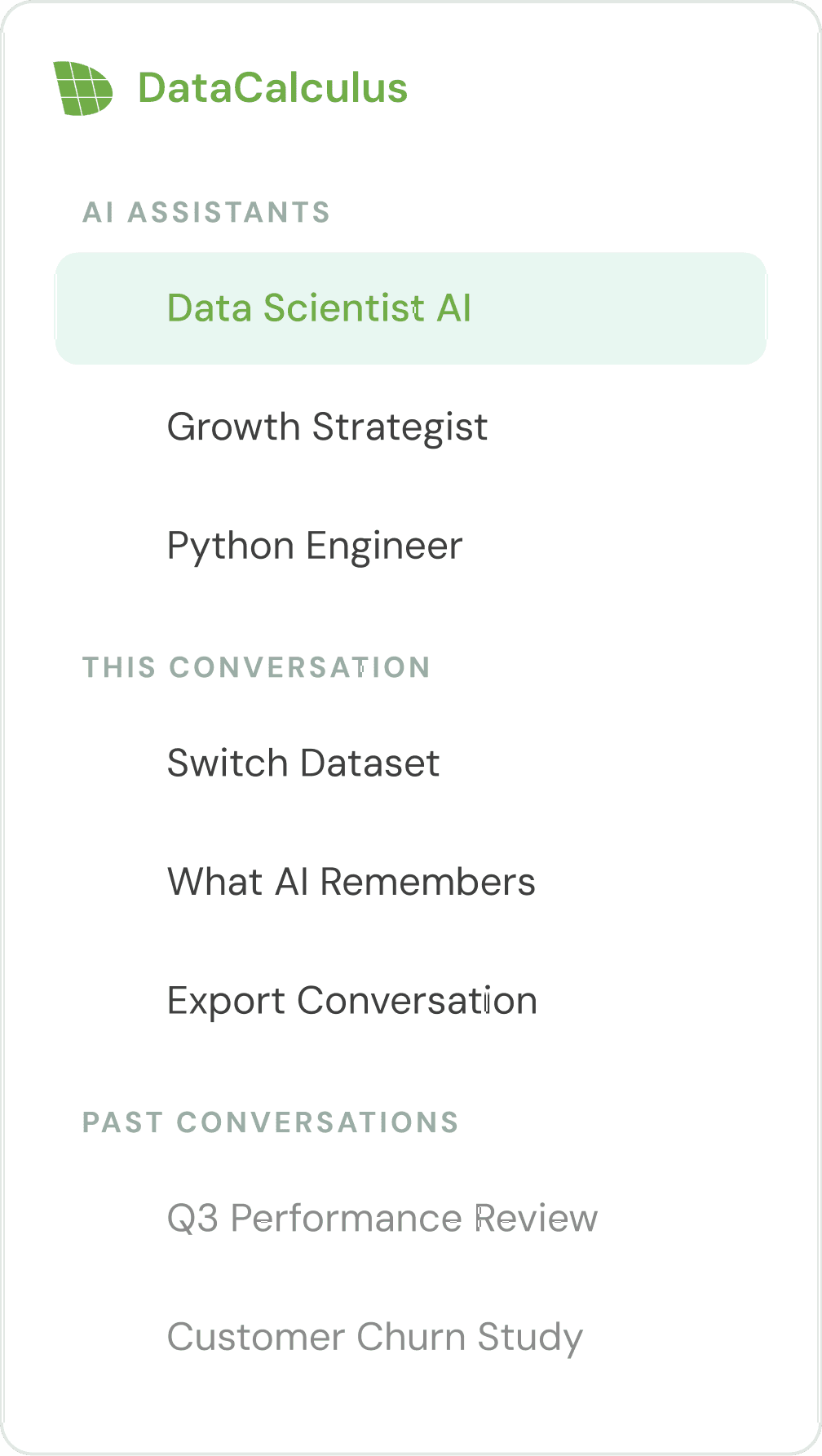
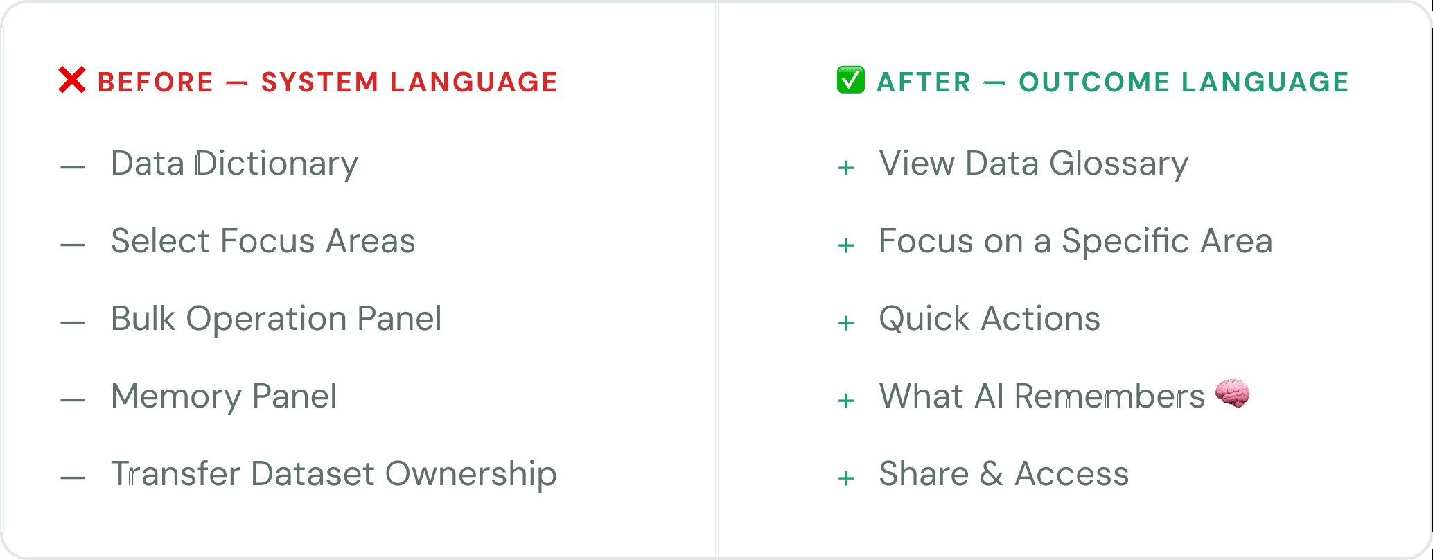
The navigation used technical labels that were difficult for non-technical users to understand.
I replaced them with clearer, action-based language.





DataCalculus has two products, but the original popup did not clearly explain the difference.
I redesigned the screen with clearer labels, simple visuals, and a short description for each option, so users can choose the right path more easily.
❌ Before — Users saw two vague options with little guidance.
✅ After — Each option clearly explains what the user can do and what happens next.
Key change
“Analyze your data” became “Understand your data.”
“Understand” feels simpler and makes the product feel more helpful for non-technical users.
This project taught me that the clearest solution is often the simplest. I would test the memory flow with real users before launch.