
Mefflow Case Study
MedFlow is a personal health companion that replaces the fragmented mix of apps, sticky notes, and unanswered questions that caregivers and chronic patients navigate every single day.
Methods
Desk Research
13 Question Survey
User Persona
Competitor Analysis
Iterative Usability Testing
Our Team
2 UX/UI designers
My role
User researcher, Visual designer
Duration
Jun 2024- 8 Weeks
Niche
iOS Mobile Healthcare App-
End-To-End Product Design
Problem
Managing health has become a full-time job and nobody signed up for it.
Picture this. It's 7am. Sarah is a 38-year-old working mother. Before she gets her kids ready for school, she checks her elderly father's medication schedule, written on a sticky note on the fridge. She opens three different apps. One for appointments. One for prescriptions. One to message the doctor. None of them talk to each other.
Then there's Michael, 65, managing hypertension and diabetes. He sometimes forgets his morning dose. Sometimes he feels dizzy in the afternoon and wonders, is this serious? Should I call someone? He doesn't know. So he waits.


"There's no single tool built for people who are responsible for someone else's health as well as their own."
Through research, five distinct failure points kept surfacing; not once, but consistently, across different ages and health situations.
💊
Missed & conflicting medication schedules
No reliable system for tracking multiple medications across a household. Paper notes fail. Phone alarms get ignored.
👨👩👧
No tools built for caregivers
Every health app is designed for one person. Caregivers managing a parent, child, or partner are completely unsupported.
📱
A fragmented, disorganised experience
Users switch between 4–5 apps per health-related task. Each has its own logic. Nothing connects.
🗓️
Poorly managed appointments
Finding the right doctor, checking availability, and getting confirmation is still a frustrating, multi-step ordeal.
😟
Anxiety when symptoms appear
Without accessible guidance, users freeze when something feels wrong, delaying care out of uncertainty rather than urgency.
💡 These five problems share one root cause: healthcare tools are designed around episodes of illness not the daily reality of managing health; your own or someone else's.
Approach · Research
We started by listening. Really listening.
Before any wireframe was drawn, we ran a 13-question survey with 26 participants across different ages, health situations, and tech confidence levels. Some findings confirmed our suspicions. Some surprised us entirely.

🎯 The most striking finding: every user who had tried healthcare apps still felt underserved. They had found tools; but not a solution.
Competitive Landscape
The market is big. The gaps are bigger.
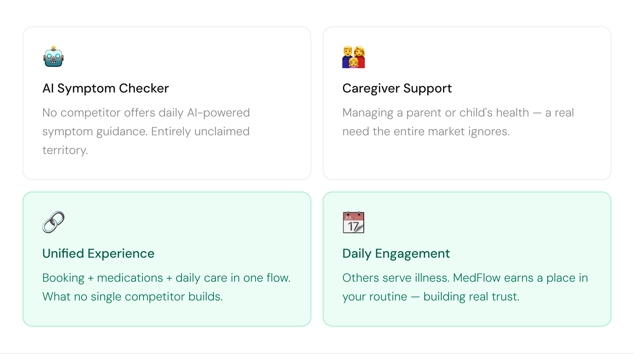
We audited four major players. Each does one thing well. None do everything. The gaps between them are exactly where MedFlow lives.

Who We Are Designing For
Two people. One app. Zero compromise.
Not archetypes invented in a workshop; composites drawn directly from what real users told us.


When we debated a feature, we asked: does this help Sarah coordinate care? Does this help Michael feel less alone? If the answer was no to both; it didn't make it in.
Design Process
How we got from insight to interface.
Not archetypes invented in a workshop; composites drawn directly from what real users told us.

Information Architecture
Where does everything live and how do users move through it?
MedFlow is organised around five top-level sections, all accessible from a persistent bottom navigation bar. Each section owns one job. Nothing is buried more than two taps from the home screen.

● MVP scope, features marked above were prioritised for the first release based on highest user need and lowest implementation risk.
User Flow
Booking An Appointment
Adding A Medication


💡 Design decision: the "Who is this for?" branch was added after Sarah's persona emerged from research. Without it, MedFlow would have been another app that only works for one person. With it, it becomes genuinely useful for families.
Solution
Five problems. Five decisions. One connected app.
Each solution below traces directly back to a specific pain point from research. Nothing was added because it seemed like a good idea. Everything is here because a real user needed it.
Solution 1
A smart reminder system that removes every excuse to forget.
The problem wasn't that users didn't care about their medication, it was that every existing system made it too easy to fail. Manual entry is slow and error prone. Generic alarms get ignored. Paper schedules get lost.


💡 Why barcode scanning matters: manual medication entry is where most reminder apps lose users. Scanning removes the barrier entirely — a bottle that takes 30 seconds to add gets used. One that takes 3 minutes doesn't.
Solution 2
Collaborative Family Care
Most health apps are built for one person. But Sarah manages her children’s schedules, her own medications, and her elderly mother’s prescriptions, all at once. So we built shared medication routines with caregiver permissions. Family members receive the same reminders, can mark doses as taken, and view the full medication history together. No coordination calls. No sticky notes. MedFlow was designed for caregivers, not just patients.


Solution 3
Unified Health Dashboard
Research showed users were switching between 4–5 apps to complete a single health task, creating friction, confusion, and missed actions. So we built a unified health dashboard that connects reminders, symptom checks, and doctor bookings into one seamless flow. Everything works together, from appointments to medication reminders. The result is a connected healthcare experience where users never need to leave MedFlow to complete a task.


Solution 4
MedBot AI Symptom Checker
Users like Michael often delay seeking help, not because they’re careless, but because they’re uncertain if their symptoms are serious enough to act on. So we built MedBot, an AI-powered symptom checker that gives contextual, actionable guidance based on users’ symptoms, medications, and appointment history. Designed to feel warm, clear, and human, MedBot helps users feel guided, not overwhelmed.


Solution 5
Smart Appointment Scheduling
Users like Michael often delay seeking help, not because they’re careless, but because they’re uncertain if their symptoms are serious enough to act on. So we built MedBot, an AI-powered symptom checker that gives contextual, actionable guidance based on users’ symptoms, medications, and appointment history. Designed to feel warm, clear, and human, MedBot helps users feel guided, not overwhelmed.



Impact
What changes when everything connects.
MedFlow doesn't improve one part of health management. It replaces the entire fragmented system people have been stitching together with apps, sticky notes, and stress.







But the number that matters most isn't on this page. It's the moment when Sarah doesn't have to open three different apps before breakfast. When Michael gets an answer instead of anxiety. When the software feels like it's on their side. That was always the goal.
Testing and Next Steps
We didn't run formal testing. Here's exactly what we'd do next and why.
MedFlow is an MVP. Shipping the design was the right first step. Running unvalidated sessions before the core experience was stable would have given us noise, not signal. But the absence of testing isn't the end of the story; it's the beginning of the next chapter. Here's how we'd approach validation, and what success actually looks like for the two people we designed for.
"Testing without a clear question is just watching. We know our questions; now we need the
sessions to answer them."
Reflections
What I'd do differently and what I learned.
The best design decisions aren't always the most visible; they're the ones that change how something feels rather than how it looks.



