Emart Case Study


Methods
Desk Research
User Interviews
User Persona
Journey Map
Competitor Analysis
Impact–Effort Matrix
Wireframing & Prototyping
Feature Design
Design System
Iterative Usability Testing
Our Team
2 UX/UI designers
My role
User researcher, Visual designer
Duration
March 2026-May 2026
Project Overview





Project Timeline

Research
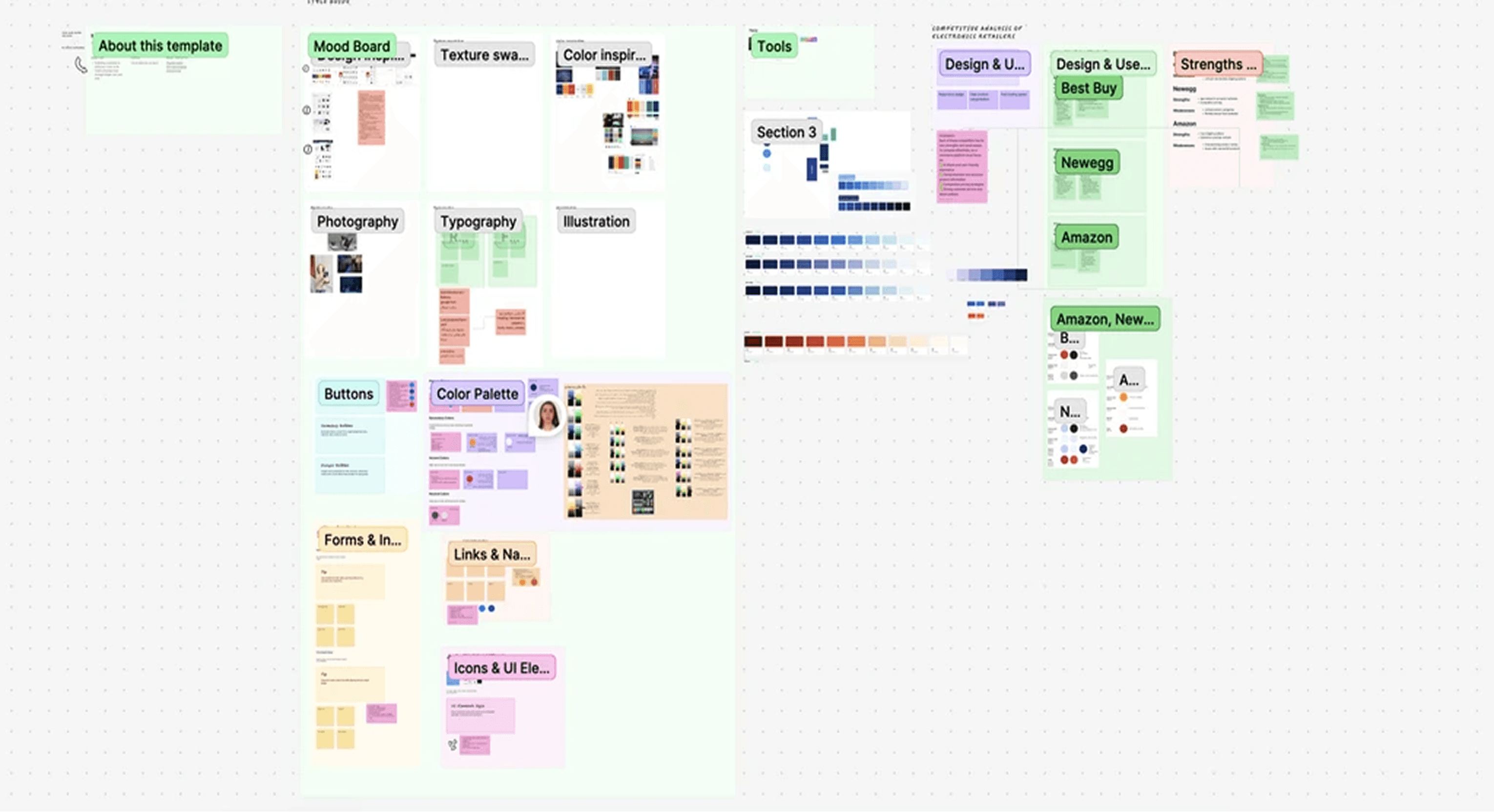
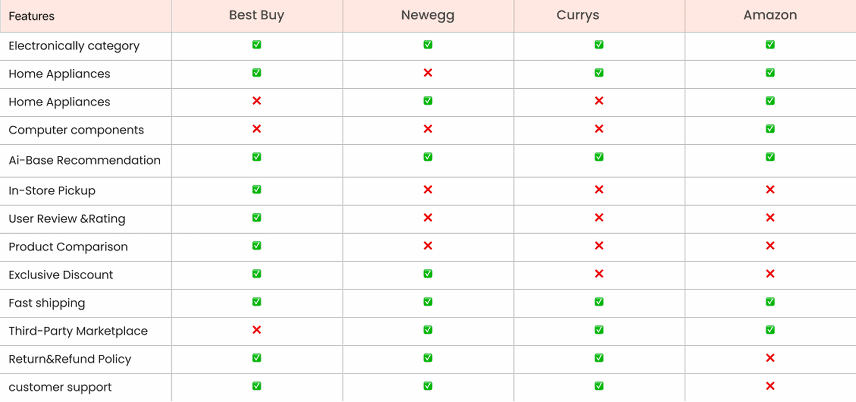
We researched several leading electronics e-commerce websites, including Amazon, Best Buy, Currys, and Newegg, to understand how they work, focusing on layout, navigation, user flow, and visual design.
Competitive Analysis
What they did well:
Amazon excels at personalised recommendations and fast checkout
Best Buy has strong product filtering and in-store pickup integration
Currys offers clear product categorisation and a clean layout
Where they fell short:
Most platforms make it difficult to compare products side by side without opening multiple tabs
Navigation is often cluttered with too many categories competing for attention
Product pages are overloaded with information, making it hard to find what actually matters
Checkout flows are long and friction-heavy, especially for first-time users
What we decided to do differently:
Build a dedicated comparison tool as a core feature, not an afterthought
Design a clean icon-based quick access menu so users can jump to product categories instantly
Keep product pages focused on key specs, with a highlight differences toggle for easy scanning
Create a streamlined checkout flow with fewer steps and clearer progress indicators
User Flow
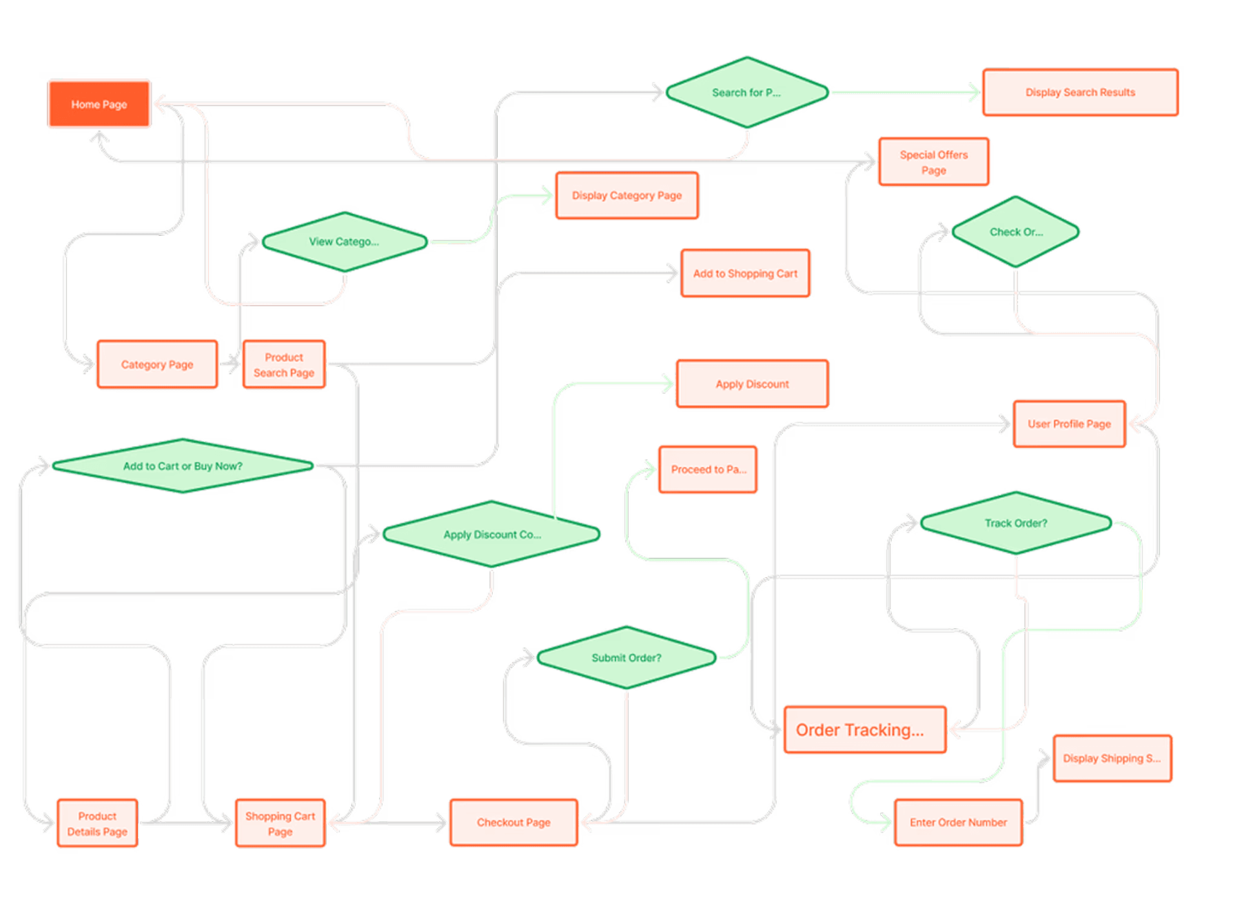
We designed user flows to map key actions such as browsing products, using filters, comparing items, adding to cart, checking out, and handling returns. These flows helped us create a smooth and logical journey, ensuring users can easily explore and compare products before making a purchase decision.
Wireframing
At the beginning of the project, each team member was responsible for creating low-fidelity wireframes for different sections of the platform. This approach helped us generate diverse layout ideas, align on structure, and test user flows early in the process.


Style Guide
We chose orange as the primary colour for the Emart electronics website because it conveys energy, innovation, and enthusiasm – qualities often associated with technology and modern gadgets. Orange is also an attention-grabbing colour that helps highlight key actions like "Buy Now" or "Add to Cart," enhancing user engagement and conversion. Additionally, it creates a friendly and approachable feel, making the shopping experience more enjoyable for users.


Components
We chose orange as the primary colour for the Emart electronics website because it conveys energy, innovation, and enthusiasm – qualities often associated with technology and modern gadgets. Orange is also an attention-grabbing colour that helps highlight key actions like "Buy Now" or "Add to Cart," enhancing user engagement and conversion. Additionally, it creates a friendly and approachable feel, making the shopping experience more enjoyable for users.

Prototype & Test
After completing the wireframes and visual design, we created a high-fidelity interactive prototype to simulate the full shopping experience. The prototype includes key user flows such as browsing products, using filters, viewing product details, adding items to the cart, and completing the checkout process. Then we tested the prototype with users to observe how they interact with the design and to identify areas of confusion or friction. Their feedback helped us make improvements to navigation, button placement, and overall usability. The goal of this prototype was to ensure a smooth and intuitive journey from product discovery to purchase.

Test Insight
After conducting the usability tests, we realized that integrating an AI-powered assistant or smart search feature could significantly improve the user experience. Many users found it time-consuming to click through multiple pages to find products. By adding AI, users could simply choose from options to find their needs and receive personalized results instantly, reducing friction and making the shopping experience faster and more intuitive.

Reflection
This project taught me that good design isn't just about how something looks; it's about how well it works in the real context where people use it.
Design for the device, not just the screen. We learned this the hard way. When we added features like the product comparison tool, we initially focused on the desktop experience. But through testing, we realised users often browse electronics on their phones first and switch to desktop only when ready to buy. This pushed us to rethink how comparison works on smaller screens, and reminded me to always ask "where and how will users actually use this?" before designing.
Start with the core problem, not the features. Early on, we were excited about building features: a dashboard, wishlists, and rewards points. But the real breakthrough came when we focused on the one thing users struggled with most: comparing products. That focus made every design decision clearer and the final product much stronger.
A design system saves you twice. Building 100+ components felt like a lot of work upfront. But it paid off massively during iteration; when testing feedback required changes, we could update once and see it reflected everywhere. I'll never start a project without building the system first again.
Testing reveals what assumptions hide. Our usability tests showed us that users wanted an AI-powered search assistant; something we hadn't planned for. That insight came directly from watching real users struggle to find products across multiple pages. It reinforced that no amount of design intuition replaces actually watching someone use your product.